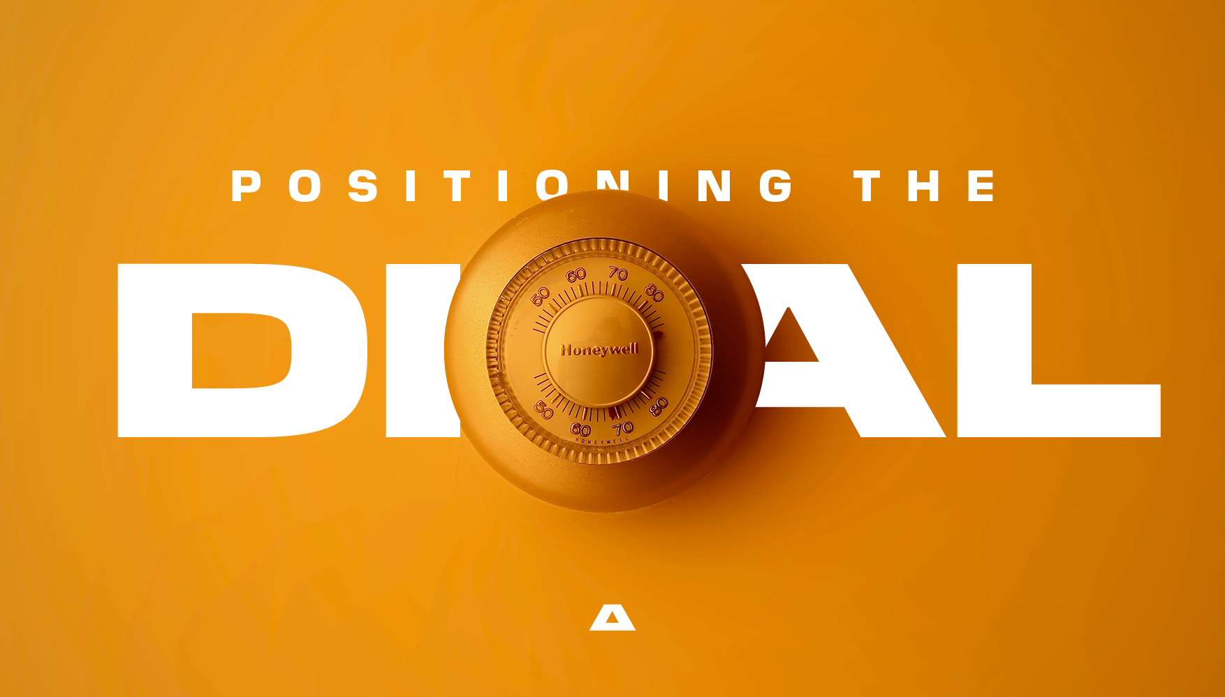
Balancing concepts in graphic design is pivotal to crafting visually appealing and coherent messages. Whether it's contrasting simplicity with complexity or blending tradition with innovation, the interplay of different ideas can elevate a design from ordinary to extraordinary. This balance ensures that a design communicates effectively without overwhelming the viewer.
Effective graphic design doesn't just catch the eye—it engages the mind. By merging various concepts, designers create richer, more dynamic compositions that resonate more deeply with audiences. For example, the juxtaposition of a modern font with a vintage colour palette can appeal to both nostalgia and a sense of the contemporary, capturing a broader audience’s interest.
Moreover, balancing conceptual elements can enhance the functionality of a design. It can guide the viewer’s eye through the layout strategically, emphasising the most crucial information while maintaining aesthetic harmony. This technique is essential in advertising, where capturing attention and conveying a message quickly is vital.
Understanding and mastering this balance is not just an artistic endeavor but a strategic one. It requires a deep understanding of both the elements being used and the audience they are intended to engage. Thus, balancing concepts isn't just about making things look good—it's about making them work effectively and resonantly in the minds and hearts of viewers.

