You may have seen posts on LinkedIn recently showing the simplification or 'debranding' of logos, often captioned with a designer's distaste for moving towards something less characterful and unique. But what does this mean in the sporting arena, and how and why might you move your brand into this direction?
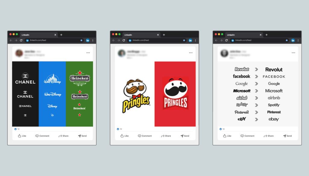
Typically, logo simplification happens for three reasons:
- The demand for mobile/digital-first design.
- Required flexibility to apply the logo to various channels and mediums.
- Maturity and confidence.
So any organisation using social media (and let's be honest, who isn't) may want to consider moving towards a simplified logo. But regardless of the reasons, simplicity isn't a new idea, and the challenges of medium and scale were just as important 40 years ago as they are today. The difference now is that with the high turnover of digital media, brands have realised that audiences are less focused on their logo and more engaged by the content it produces. The 'fall of the logo' therefore means that more attention should be given to the application of the identity, with due consideration given to what is consistent and templated, versus what is different and creative (look out for our next post 'Brand vs Campaign: The Art of the Same, But Different' for some thoughts on this).
This breeds the necessity for a far more holistic approach to brand identity creation, where the application of the identity plays a bigger role in determining the creative direction the logo and identity go in. So whilst this might be disappointing news for an old-school logo designer, it does create exciting opportunities elsewhere.
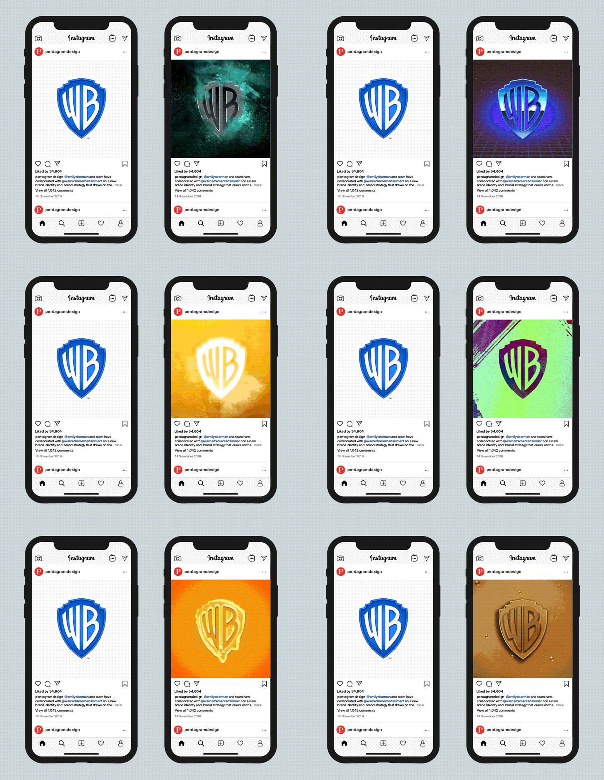
With sports brands increasingly acting as entertainment platforms, sports identities are likely to and already have started to, move away from strict monolithic identity systems where little within the system can be changed. It's going to be far more advantageous for sports brands to have a flexible identity system where certain elements can act as vessels or portals, ready to be filled with media relevant to a particular output. For example, here's Pentagram's Warner Bros. identity, introduced in 2019:
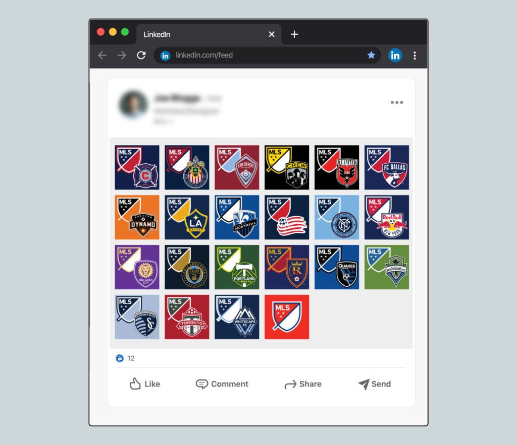
The idea of sports brands integrating flexibility into their identity is increasing in frequency. For a while, it's been quite common for clubs to create away and third kit colour versions of their logos to use in matchday social posts. Taking that a step further, way back in 2014 Major League Soccer (MLS) embraced a flexible logo system where participating club colours could replace the colour within the master logo, an approach I think would be smart for other championships in sport to consider i.e. the 6 Nations.
Even more recently, in 2019 DixonBaxi's beautiful branding work for AC Milan has made the club feel much closer to an entertainment brand, with an approach that feels similar to Pentagram's Warner Bros. rebrand. I think it's fair to assume then, that with the continuation of logo simplification, more sports brands are likely to take similar approaches, and I for one, am all for it.
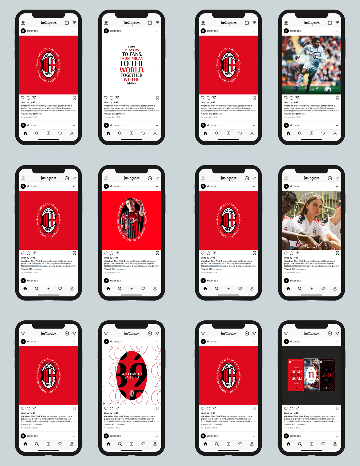
These flexible and comprehensive identity systems help to create interesting, intriguing and engaging brands, and I'm surprised more championships haven't taken a flexible identity approach. Not only is it engaging for a championship identity to have the capability to integrate competitors into their identity, but also from a rights holder and sponsorship perspective, having a championship identity that can work seamlessly with a title sponsor can make a huge difference to the look and feel of a sporting event. Then even at a competitor level, being able to integrate with sponsors and other aspects of their brand is just as useful – that's quite a big topic so look out for a blog post covering that soon.
If you'd like to discuss logo simplification, and the digital evolution toward flexible identity systems feel free to give us a shout at Hello@grandslam.studio

